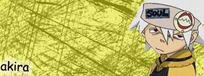
 comments pls.and, this is the first sig i made and im a noob. :-\
akira411
#41
comments pls.and, this is the first sig i made and im a noob. :-\
Forum archive
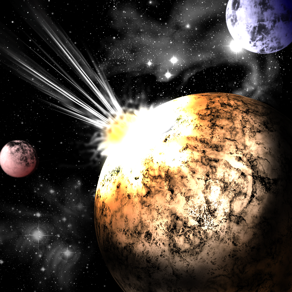
comments pls.and, this is the first sig i made and im a noob. :-\AlmoMy latest large art, go on, someone rip me apart.Flat, overcontrasted, boring textures. Impact effect sucks, not realistic at all. Needs more color variation. The composition is non-existant.