Back to The Graphics Guild
What a colorful world o_O
K
ionno if this was made from boredom or to keep my mind off the fact that i missed every fricken layup shot in gym... screw you >_>
this was some experimenting so C&C, and enjoy
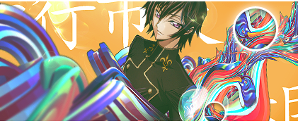
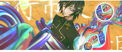
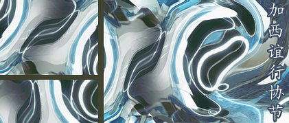
EDIT: this was a
C4D that i messed with, was supposed to be the background but i tossed it;
Nice. I really like the color of the 2nd one. :) How do you do that?
K
which one? the blue one or the 2nd lelouch sig?
K
Leleouch one is goodbut never use a C4d or something similar like what you used for a background. it destroys the focal and messes up the flow
K
K
Replying to #5
no it does. C4ds should only be used to improve your focal's flow or use a blending mode to add a small effect look. dont just slap it on there with a filer or it will look like you spend no time working on anything. C4Ds stand out too much and hurt the focal. on the second one where you took a C4d and messed with it, there is no depth or a focal on the second one.
that's a pretty shallow range of usage you just stated ._.
yes, slap it on, that's what people nowadays do besides just smudging and brush everything w/o understanding the flow :\
that's if you don't know how to blend it...
i said i tossed the second one, coulda been of use as a background but i couldn't work it out
K
uhhhi kinda noob with the "flow"what is the "flow" youre talking about?
K
Kukuru, Flow is where things revolve around the focal and make it look better so it is the first thing they are supposed to see. When you use a render(like lelouch here) you want things to revolve around it as a focal. It is supposed to "go" with the focal. Placing a horizontal render on a vertial positioned city would be going against it. The background here is not flow with lelouch, it is just there with text. The rainbow render goes up in the same direction, nut is noticeably much bigger and stands out before Lelouch does.You ask for C&C and I gave it to you. That's basic knowledge of what I stated. It is what is taught commonly. Don't use abstract renders like you did. You're not supposed to notice it before the focal, which is supposed to be the Lelouch picture. I see the rainbow colored thing before anything else which isn't supposed to happen. I am not a perfect gfx artist myself but I understand basic concepts. Though I apologize and say there is a little bit of depth there with the blurred side of the C4d, but the rest looks pretty flat
K
that is new to me.
im making sig without knowing it. Thats why nex was saying my sig doesnt have flow...thanks for the knowledge Kakeh!
K
Kakeh715Kukuru, Flow is where things revolve around the focal and make it look better so it is the first thing they are supposed to see. When you use a render(like lelouch here) you want things to revolve around it as a focal. The background here is not flow whit lelouch, it is just there with text. The rainbow render goes up in the same direction, nut is noticeably much bigger and stands out before Lelouch does.You ask for C&C and I gave it to you. That's basic knowledge of what I stated. It is what is taught commonly. Don't use abstract renders like you did. You're not supposed to notice it before the focal, which is supposed to be the Lelouch picture. I see the rainbow colored thing before anything else which isn't supposed to happen. I am not a perfect gfx artist myself but I understand basic concepts. Though I apologize and say there is a little bit of depth there with the blurred side of the C4d, but the rest looks pretty flat
much better now
yea... flat, i can understand that it partially is >.<
the background is just there as a wall is with graffiti
i admit, lelouch doesn't stand out much, but he seems to stand out more since he goes against the "rainbow"
@kukuru:
flow is pretty much how the sig/focal "moves"
take a person looking up, and say you're making a sig
you'd want to give it a sorta "rising" appearance to it
depth is looking into it and not just looking at an image
creating distance, and use of vanishing points to make it seem like another world is within your work
a road for example, up close would appear blurred as your looking at the end of the road
up close things are bigger but blurrier, and as you go down the road decreases in width
a method used for drawings, so it'd be better to look it up that way or at professional photography photos as references
Lighting, the source of light that creates the darker and lighter areas that are in a sig
can range from sunlight, lamlight, glow, etc. effects which will determine how dark and light it is
that was a typo. it was supposed to say but. I can't type very well as my left hand hurts after typing for a while so I use my right hand solo. You can use an abstract render as a background but only if it is barely noticeable that you did. Try to cover parts of it up like add brushes, darkness, lighting, or what you can to make it like you never used it. Or you can use one and set it to a blending mode to add some other effect to your picture. just make sure when you use a render like Lelouch, focus on him and make sure he is the main pointanyway here is a bit of thing to help anyong understand flow.what is your intention to start? If it is for example to make a Goku sig, then Goku should be the main point of the sig, no a cool C4D or a background. Those are nice and make it look pretty, but Goku should be the main point of the sig
K
and, i'm home
and i'd like to apologize for the attitude earlier, today was a crappy day...
K
if I wasnt clear earlier, depth and and flow are key in sig type graphics. its basic structure. however everything else is up to you and how you want it. never take C&C too harshly. It is an opinion and you don't always have to agree with it, but you should never question it, just accept it. There are no rules in design. Don't let people try to give you rules. If they want to give you tips to improve in style and appearance, then let them, but never let them tell you ow everything is supposed to be done. There are however, some elements that make a type of art what it is. Keep those parts in mind but then let yourself run the rest
K
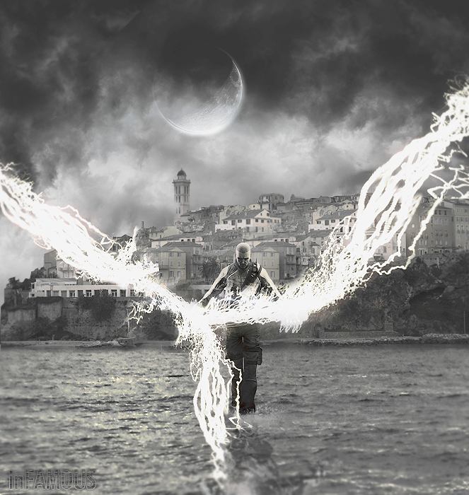
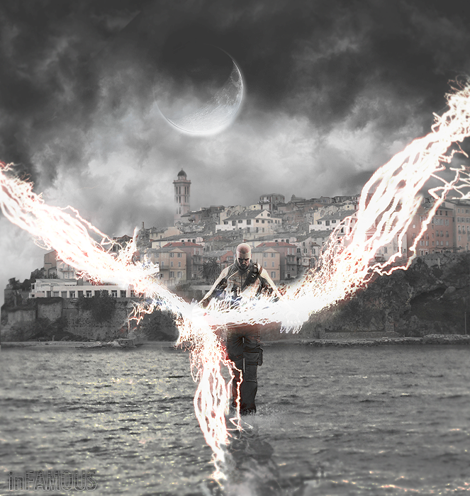
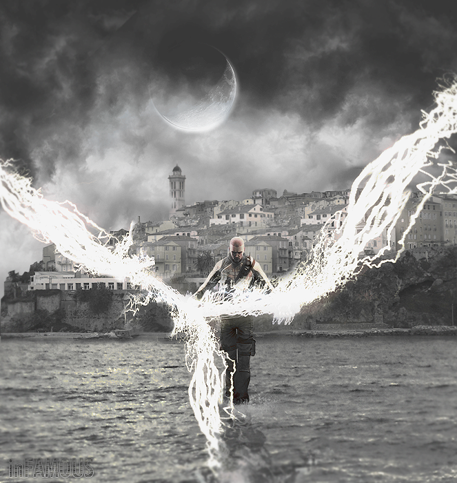
well, my first photo manip
fire away cuz some of this is out of place, i just know it -.-"
EDIT: a'right, i lied >_>
Showing posts 1–15 of 15 · This discussion is archivedBack to top