Back to Site Support
V2 Feedback
P
First time I've been on this site, but it looks pretty good ;D
S
The skin used now looks intresting. It still needs to be worked with.
V
To be totally honest, I liked the old one better, and I have a couple of reasons. Firstly, the blank spaces on the sides are stretched out quite a bit. When I have my Firefox open in a window if often makes it so the posts are a bit scrunched. Though I do like the top banner (the diagonal little lines) the text just doesn't look quite fitting with it to me. Also, once you enter a forum to view threads, it looks a little Windows 98. I'm mostly referring to the "new" buttons. It looks really generic and MSPaint.I hope I don't sound too critical cause I definitely don't hate the new theme, I just do like the old one better. :-*
A
only just found this thread, I hate the new theme lol, Im using the old one.
A
I agree with Void the grey sides are annoying because it make the page longer when you could just extend it, but i guess this is good for people with small monitors. Also if you ever feel the need it would be awesome if you could make a basic html coded forum site that i could use with my ds organize browser. Because although its possible for me to view the page its very hard. ;D
S
You're all free to choose a different template, but this one stays.Airsoft: If you phone/DS sends along the proper required HTTP headers telling what it's capable of then it should display the appropriate page, here's the mobile version though: https://www.romulation.org/forum/index.php?wap2
A
Ok well thanks for that Seph, i didn't realize there was a mobile version. ;D But so far the V2 looks great, works well and is easy to use.
D
The sites improved since I've last been here. Great job Seph and Loony and NM :)
S
Loony and NM does nothing but provide moral support. :P
D
Well i didn't know they had updated the site, (becuase i came late :P) But it looks very cool and i like the look. I wonder how the old one looked? :-\
L
S
Like this: http://web.archive.org/web/20070429110640/https://www.romulation.org/Now sure how many images will get loaded, it'll be slow regardless.Edit: Loony's is better. :)
C
Yeah, loony's is pretty awesome.
J
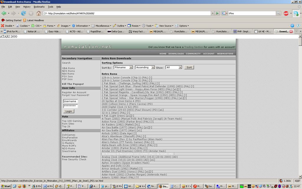
wtf? how many things do you have running at the same time, loony? your pc is sure do strong!
C
I see Winamp, MSN messenger, Yahoo messenger (?), word pad, notepad (again, ?), 6 floders, Flash (MX maybe?), Fireworks, Widows calculator, and some others. Most of those programs don't take up much CPU usage, although his CPU bar is up pretty high :D
L
CPU bar?
J
he means the tools bar, or somewhat like that.
C
When I see green spiking up, I automatically think of a CPU bar.......but I guess thats a square.
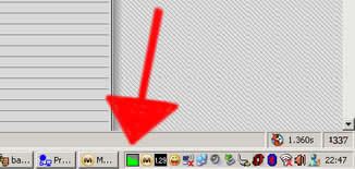
If that's not showing how much CPU is being used then what is it?
Sorry, I don't use the Windows classic interface.
The most important icon is the little blue one with a white speedometer. WinCacheGrind, essential to profiling PHP code. :D
L
CloudBoy101 · #38When I see green spiking up, I automatically think of a CPU bar.......but I guess thats a square.If that's not showing how much CPU is being used then what is it?Sorry, I don't use the Windows classic interface.
It's showing the traffic through my proxy bypass software :)
Showing posts 21–40 of 44 · This discussion is archivedBack to top