Back to The Graphics Guild
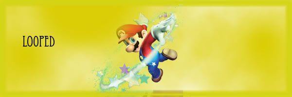
my first sig
L
hows this for a beginner?
I don't see anything...
L
oh sorry about that..its fixed now
J
Koo. I just like Mario. ;D
J
well...i suppose it's fine, considering that it's your first sig. not to be harsh but...but isn't it too big, too simple and too plain? :-\
L
Terrible
A
Replying to #6
I don't care if it's your first, you still could have done way better.
Replying to #7
Agreed... Get some brushes, fonts, C4D's, etc.
God damn you two, be nice it's his first time.
M
Littlekill · #6Terrible
LittlekillGod damn you two and myself, be nice it's his first time.
Fixed it for ya.
Looking back on what I said, I guess I could have been nicer. My first sig was crap. Worse than his.
Not bad...
A
I'm sorry if I sound like a jerk, but you could have really pimped that out some more.
A
it's ok I guess,
but i hate the font :/
C
good for your first sig, mine is much worse back then. I could say that's should be quite minimalist style. maybe a bit more focus on mario (sharpen it a bit) would be nice.
Showing posts 1–14 of 14 · This discussion is archivedBack to top