Back to Portfolios
Equitypetey portfolio
E
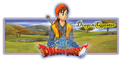
well here is my portfolio not really in any order but it is pretty much old to new as you go down (notice a bit of progression)
as you can see i have made many sigs for others so if you'd like one PM me
comments welcome
enjoy!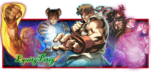


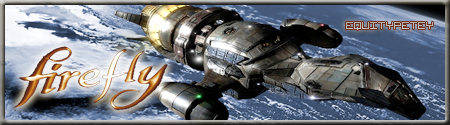



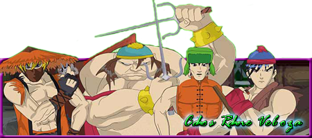
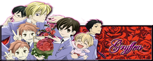
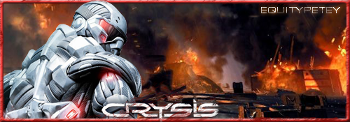

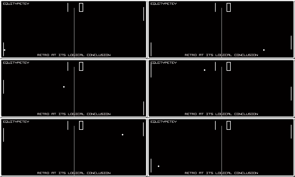
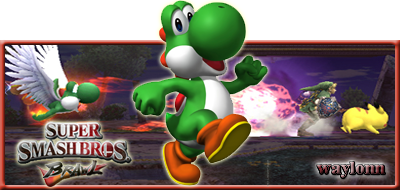

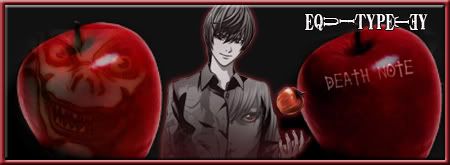
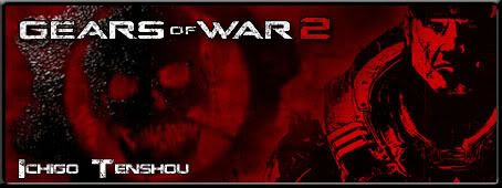
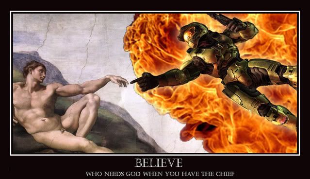

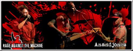

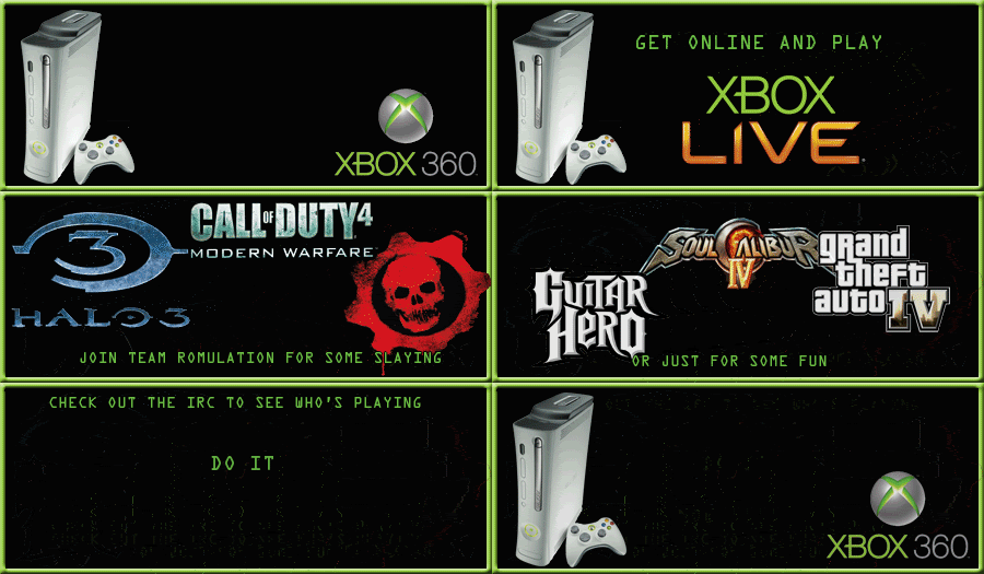
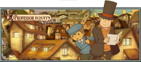



 SOTW# 1 1st place
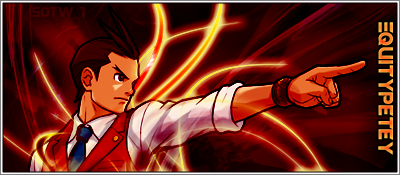 SOTW# 2 2nd place
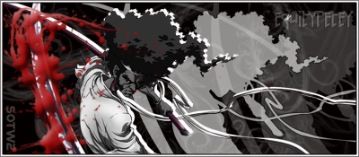 SOTW# 3 1st place
 SOTW# 4
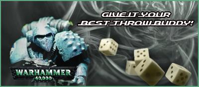 SOTW# 5 3rd place
 SOTW# 6 joint 2nd
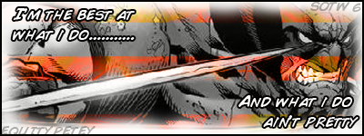 SOTW# 7 3rd place
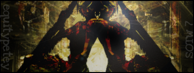 SOTW# 8 1st place
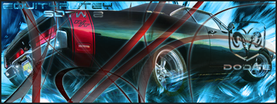 SOTW# 9 1st place
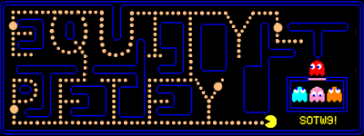
N
THat retro sig is awesome.
C
Hey there's my sig! Thanks again equity, you rock
E
Nice work Equitypetey!
C
What the!?Hey einherjar, I see the linked Tri-skelion logo on your sig, although it's upside down & white instead of yellow. Are you a Tau Gamma Phi-an?
E
No, it's a Valknut. In northern mythology, the valknut was the sign of those who fell in battle (The Einherjar) Val = fallen knut = knot ;)
C
Oh, it really looks like our Fraternity's insignia

See?
E
Lol, yes! Never knew that... The valknut stands for the eternal circle of life and death, that's why all three the triangles are fully drawn
C
Darn I had a hard time posting that thing properlyAnyway that's kinda the same for our fraternity's insignia, the cycle of life & death, but each triangle also corresponds to three things, brotherhood, loyalty & unity
E
I'm Dutch... Never heard of it before. Thanks you for expanding my knowledge!;)
C
Well actually my fraternity's not that popular or as big, it only currently has chapters here in the Philippines & a few in California
D
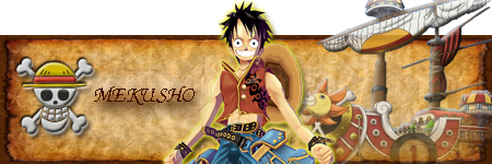
i like the one piece sig, keep up the good work
W
einherjar · #10I'm Dutch... Never heard of it before. Thanks you for expanding my knowledge!;)
YOU DUTCH TOO!?
Omg, I tought I was the only one :D
thought i'd be naughty and bump my portfolio since there has been a few updates
U
ummm i like the Mekusho one best ;Di might have to drop out of SOTW2 to avoid being an embarrassment :D
E
there is no embarrassment, its not about winning its about seeing what you can do and pushing your self
R
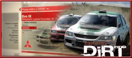
Your SOTW entry is sweet. How do you get those cool borders? The ones like the one that was used in the Mitsubishi sig.
E
the borders are nothing more then a stroke and then maybe an effect, my early ones all had a bevel out on too
E
updated!
C
Equitypetey..
I love your work.
And I'm jealous :(
now go comment on my work ;D
Showing posts 1–20 of 20 · This discussion is archivedBack to top