Back to Portfolios
DragonQuester's Portfolio
D
F
Hmm... Good for a Beginner man... Keep it up.

this Signature is the best in your Portfolio.
and try looking tutorials.... here are my tutorials on Romulation.net too... :)
Replying to #2
Thanks man... And I'll look at tutorials, as well as yours :D
EDIT: btw, i added 2 new signatures... I used tutorials this time... tell me what you think
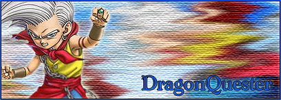
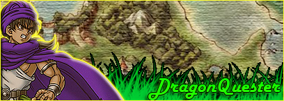
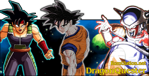
You're good, it's just alot of your siggys have to many renders, and are all ... well, they're all the same, really.
They all have the same basic layout.Although your current Buu sig is Effing hot.
D
Replying to #4
Thanks man :P I know I've got to change my layouts a bit :P
Replying to #5
Try reducing the size of your renders.

You should really give Cell a 1px DarkPurple outline, and saturate Trunks' shirt. It'll look really good.
EDIT: Just realised i said the exact same thing in the discussion thread :3
Replying to #6
lol okay, I'll try to get to that soon but for now, Im trying those tutorials :P
EDIT: Made a new Broly signature.. check it out ;D
Saw it, needs a different render.
B
DragonQuester · #7lol okay, I'll try to get to that soon but for now, Im trying those tutorials :PEDIT: Made a new Broly signature.. check it out ;D
Whoah, you're too much with akira toriyama's drawings there.
nice sig
your sigs must be better if you use PSbtw, this is my first day using PS
D
Replying to #10
Yeah you can see the progression because when I first started, I was using MS Paint, then GIMP and now PS
EDIT: Hey guys, just added a new Cell sig
Jeebus, you make sigs fast :P
But seriously, you need more variety.
They're all the same :/
K
how about other than akira toriyama's work?looking forward for your next sig!!
C
yes I think they look nice, but I see alot of repetition :P
you should really try to expand, take requests and participate in the SOTWs, that should help you alot
D
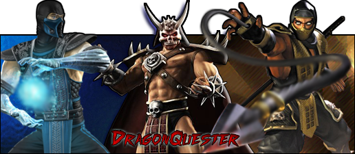
lol Everyone is telling me that Im repetitive :P But I agree... I'll start doing a mixture of Akira Toriyama's work, and others :DEDIT: I made a new Dwayne Wade sig and a new GTA Chinatown Wars sig, (for once not associated with Akira Toriyama :P)And I also added a sig that I entered for the SOTW (Naruto VS Bleach)
C
You just... don't stop... do you? LOL
D
LOL no, Now Im into Photoshop... When I go on my computer, my first thing to do is PS... So how do you think my SOTW entry looks?
K
remove the paint productsyour ps products are fabulous
D
Replying to #18
lol the only reason I keep the Paint products there is to see how I've improved SO much from just splashling Renders on a background, to playing with brushes, layers, and making cool effects... I definately lik my PS products better, but I just want to see how much I have improved :P
That's pretty nifty, you showing how much you've improved. o: . I should've kept my older sigs, haha.
The list thing is getting long though, maybe change them to link form? O: .I agree with the first poster though, the Mario one catches my eye the most. *-*.
Showing posts 1–20 of 29 · This discussion is archivedBack to top







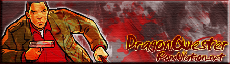

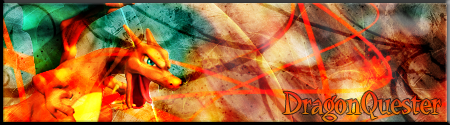


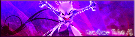
 SOTW #16 Entry:
 SOTW #17 Entry:
 ----------------------------------------------------------------------------------------------------If You Want To See A Bunch of My Graphics Made in MS Paint and GIMP, Please go to this website:http://dragonquester.webs.com/